When we think about navigation menus, we often focus on labels or translations. But there’s another hidden layer that affects user experience just as much: the order of items.
Navigation order might seem like a minor detail, but it plays a huge role in how users understand, trust, and flow through a website. In multilingual design—especially between English and Japanese audiences—menu order can even signal whether a site “feels” local or foreign.
🛑 Disclaimer:
While this article shares common website design practices that can help build trust with English-speaking and Japanese audiences, every project is different. Cultural preferences vary, and design decisions should be guided by the unique goals, audience, and context of each business. These insights are meant to serve as practical guidance and inspiration—not strict rules.
Why Navigation Order Matters
Menus are the first roadmap visitors encounter. The order shapes how users:
• Scan for what’s important (cultural reading patterns affect this).
• Decide where to go first (influencing bounce vs. deeper engagement).
• Build trust (if the order feels familiar, it reassures; if not, it can confuse).
💡 Tip:
A misplaced “About” or “Company” may seem harmless, but to certain audiences, it can feel like the site is not designed for them.
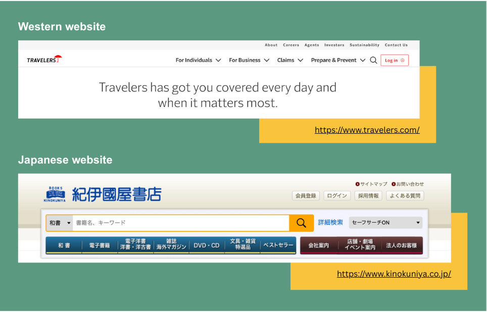
Japanese Websites: Leading with Company Identity
On Japanese corporate sites, navigation usually begins with the organization itself.
1. 会社案内 (Company Information)
2. 事業内容 (Services/Business)
3. 採用情報 (Careers)
4. お問い合わせ (Contact)
💡 Why? :
In Japan, trust and credibility come before transactions. Users want to know who you are before engaging with what you sell.
👉 Even in B2C industries, many Japanese users expect some form of “company profile” at the start.
Western Websites: Leading with Action & Story
By contrast, English-speaking websites usually start with user-facing actions or brand story:
1. Home
2. about
3. services / Products
4. Blog / Resources
5. Contact
💡 Why?:
Here, the assumption is: users come for solutions first, and they’ll look into your company background later if interested.
👉 This reflects an action-oriented mindset: “What can you do for me?” comes before “Who are you?”
Subtle But Important Differences
1. Placement of “Careers”
• Japan: Careers (採用情報) often sits near the top, showing transparency and signaling the company’s growth.
• West: Careers is usually at the bottom or in the footer—secondary for external visitors, more for job seekers.
2. Placement of “Contact”
• Japan: お問い合わせ is often one of the last main items—users read background info before reaching out.
• West: Contact tends to sit at the end of top nav or appear as a CTA button, encouraging quick action.
3. “Home” vs. “Company” as Anchor
• Japan: Some menus skip “Home” entirely (users click the logo instead) and instead anchor with 会社案内.
• West: “Home” is almost always first—it frames the site as a starting hub.
Multilingual Sites: What Order Do You Choose?
If you’re building a bilingual or global site, the order becomes a strategic decision:
• Will you mirror the Japanese expectation for credibility-first?
• Or follow Western patterns for action-first flow?
• Or blend the two with adaptive menus depending on language view?
👉 For example, Toyota’s global English site starts with “Vehicles,” while its Japanese site starts with “会社概要.” Same company—different audience expectations.
5 Quick Checks for Your Multilingual Menu
📋 Here’s a mini-checklist to test your site’s navigation:
1. Does the order reflect user priorities in that culture?
2. Is “About/Company” positioned where the audience expects it?
3. Is “Careers” too hidden (for Japan) or too prominent (for global)?
4. Is “Contact” encouraging the right kind of action flow?
5. Does “Home” or logo-only navigation make sense for your audience?
Final Thought
Navigation order isn’t just design housekeeping—it’s a cultural signal. By aligning the sequence of your menus with user expectations, you don’t just guide clicks—you guide trust, flow, and connection.