When it comes to designing websites for a global audience, one-size-fits-all doesn't work—especially when comparing user behavior in Japan and Western countries.
From how users read a page to what catches their attention, cultural differences shape everything from layout expectations to the emotional feel of a website.
In this post, we’ll explore the major design contrasts between Japanese and Western websites—focusing on visual hierarchy, layout, and use of whitespace—and offer tips for building culturally fluent, user-friendly experiences across borders.
🛑 Disclaimer:
While this article highlights common differences in website design preferences and user behavior between Japanese and Western audiences, it's important to remember that every project is unique. Design decisions should ultimately be guided by the specific goals, context, and needs of each business or individual. The insights and tips shared here are meant to inform and inspire—not prescribe one-size-fits-all solutions.
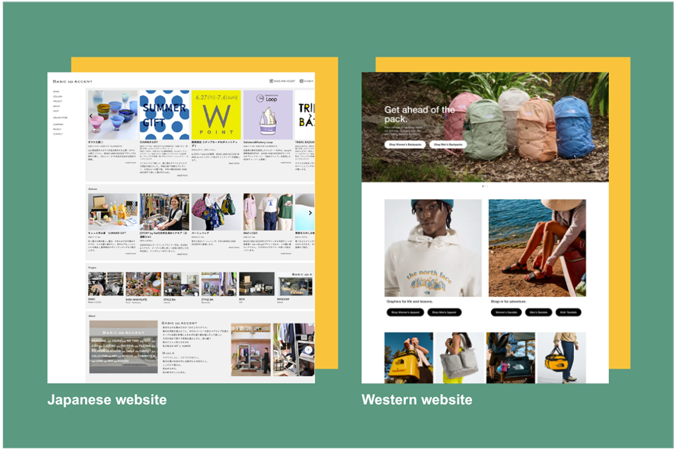
🧭 1. Visual Hierarchy: What Draws the Eye?
Visual hierarchy determines what users notice first, how they move through a page, and where their attention naturally goes. Understanding how different cultures respond to visual cues is key to designing effective, intuitive layouts.
Western users:
In Western design, visual hierarchy is often minimal, clear, and intentional. Headlines are large and bold, supported by strong imagery and clear CTAs (calls to action). Western users tend to scan pages quickly in an “F” or “Z” pattern, looking for bold visual cues to guide them.
Japanese Users:
Japanese users, on the other hand, are more accustomed to information-dense layouts. Text and imagery often share equal importance. Users may not expect a single focal point but instead engage with multiple pieces of content at once. As a result, bold CTAs and oversized headings can sometimes feel too aggressive or lacking in detail.
Tip:
When designing for Japanese audiences, consider balancing visual cues with rich content. Rather than relying on minimalism, embrace layered information supported by micro-copy and context.
🧩 2. Layout: Structure and Flow
Page structure affects how easily users can find what they’re looking for—and what kind of journey they experience. Cultural expectations around order, density, and content placement play a major role in how users perceive usability.
Western websites:
Western layouts tend to follow predictable structures: hero banner, benefit sections, testimonials, CTA, etc. White space is used generously to create breathing room and emphasize key content.
Japanese websites:
Japanese layouts often prioritize utility and density. Important information might appear near the top (like store hours or promotions), even before branding elements. Layouts may feel crowded by Western standards—but they align with users’ expectations to see everything without having to click around too much.
Tip:
If building for both audiences, consider adaptive layouts that adjust density based on language or region. Use tabs or accordions for Japanese users to reveal more content without overwhelming Western users.
⎚ 3. Whitespace: Comfort vs. Clarity
Whitespace isn’t just about aesthetics—it directly impacts readability, focus, and trust. But the meaning and value of empty space varies across cultures, and what feels “clean” to one audience may feel “unfinished” to another.
Western preferences:
Whitespace is often seen as essential—it’s not just about aesthetics, but usability. It helps users focus, creates clarity, and sets a tone of elegance or calm.
Japanese preferences:
Whitespace can be misunderstood as "missing content" in Japanese design. Especially in business or e-commerce sites, a page that’s too sparse may feel unfinished or lacking in credibility.
Tip:
Use whitespace strategically based on audience perception. For Japanese viewers, fill space with supporting content or visuals. For Western users, prioritize clarity and scanning ease.
📝 4. Typography and Readability
Typography is often treated as a design feature. Sans-serif fonts like Helvetica or Open Sans are commonly used for clean, modern readability. Line height, font weight, and contrast are carefully tuned for effortless scanning—especially on mobile.
Western users:
Typography is often treated as a design feature. Sans-serif fonts like Helvetica or Open Sans are commonly used for clean, modern readability. Line height, font weight, and contrast are carefully tuned for effortless scanning—especially on mobile.
Japanese users:
Japanese typography must account for complex kanji, kana, and mixed text formats. Fonts like Noto Sans JP or Yu Gothic are designed for clarity, but longer line lengths, denser layouts, and smaller font sizes are more widely accepted. Also, vertical text is still occasionally used in traditional or formal contexts.
Tip:
Design with culturally appropriate typefaces. Ensure line height and font size support legibility in both languages—and avoid shrinking Japanese text too much. Always test bilingual layouts for readability across devices.
🔒 5. Trust Signals and Visual Cues
Design helps users decide whether they can trust your site—often in seconds. But what builds trust in one culture may look suspicious or unprofessional in another. Recognizing these differences helps establish credibility with diverse audiences.
Western websites:
Trust is often built through minimal design, testimonials, SSL badges, clean navigation, and modern branding. Too many pop-ups or flashy banners are often seen as spammy or unprofessional.
Japanese websites:
Japanese users often prefer more direct and visible forms of trust: official seals, award icons, certification logos, ratings, contact details, and customer support numbers placed prominently. In fact, visual clutter can increase perceived trust if the right signals are included.
Tip:
For Japanese audiences, include visible, culturally recognized trust markers—even if it seems “too much” by Western standards. For Western audiences, lean into simplicity and design clarity to build credibility.
Final thoughts
Understanding how Japanese and Western users navigate websites is more than just a design challenge—it’s an opportunity to connect deeply with your audience.
By recognizing cultural preferences in layout, hierarchy, and whitespace, you can create experiences that feel intuitive and trustworthy across languages and regions. Whether you're building a bilingual site or expanding into a new market, thoughtful cross-cultural design isn’t just respectful—it’s effective.