When we think about accessibility, it's easy to assume it's something complex — or something only large companies need to worry about.
But as I started looking more closely at my own website, I realized something simple:
Accessibility isn't just about compliance. It's about clarity, usability, and how people actually experience your site.
So this month, I decided to take a step back and audit my own website starting with my homepage and services page to better understand where I can improve.
⚠️ Disclaimer:
This audit reflects my own website and learning process as I explore web accessibility and WCAG. The observations and improvements shared here may vary depending on your website, goals, and users. Please use this as a reference, not a fixed standard.
Why Accessibility Matters (Especially for Small Businesses)
Accessibility is often associated with supporting users with disabilities — and that's absolutely important. But in practice, it goes beyond that.
Have you ever injured your hand and couldn't use a mouse for a while? Or strained your eyes and found it difficult to read a screen?
Situations like these can happen to anyone. They may not be permanent, but even temporary changes can affect how we interact with a website.
Many people assume accessibility doesn't apply to them. But in reality, there are moments when we all rely on features we may not have noticed before.
Accessibility affects:
• how easily someone can read your content
• how clearly your message comes across
• how confidently someone can navigate your site
For small businesses, this directly connects to:
• trust
• user experience
• and ultimately, conversion
Guidelines from organizations like the World Wide Web Consortium provide a helpful foundation, but accessibility isn't just a checklist — it's an ongoing design consideration.
As I continue learning about web accessibility and WCAG as a designer, I wanted to understand how to apply these principles in a practical way — how to create accessible content, identify issues, and make meaningful improvements.
As I started looking more closely at my own site, I realized there were things I hadn't questioned before — especially in how people actually navigate and experience it.
By auditing my website, I'm able to step into a different perspective, notice details like features, labels, and color choices I might otherwise overlook, and improve the overall clarity and accessibility of both my own work and future client projects.
It feels like a small step, but an important one for reflection.
What I'm Auditing
Rather than reviewing every page at once, I chose to start with my homepage and services page.
These pages represent key moments in the user journey — from first landing on the site, to understanding what I offer, to deciding whether to take action.
• The homepage shapes the first impression and sets the tone.
• The services page helps users evaluate whether my work aligns with their needs.
By focusing on these areas first, I'm able to better understand how accessible and clear the experience is at the most important decision points.
Tools I'm Using
To get a baseline, I'm using a combination of tools and manual testing.
Automated tools:
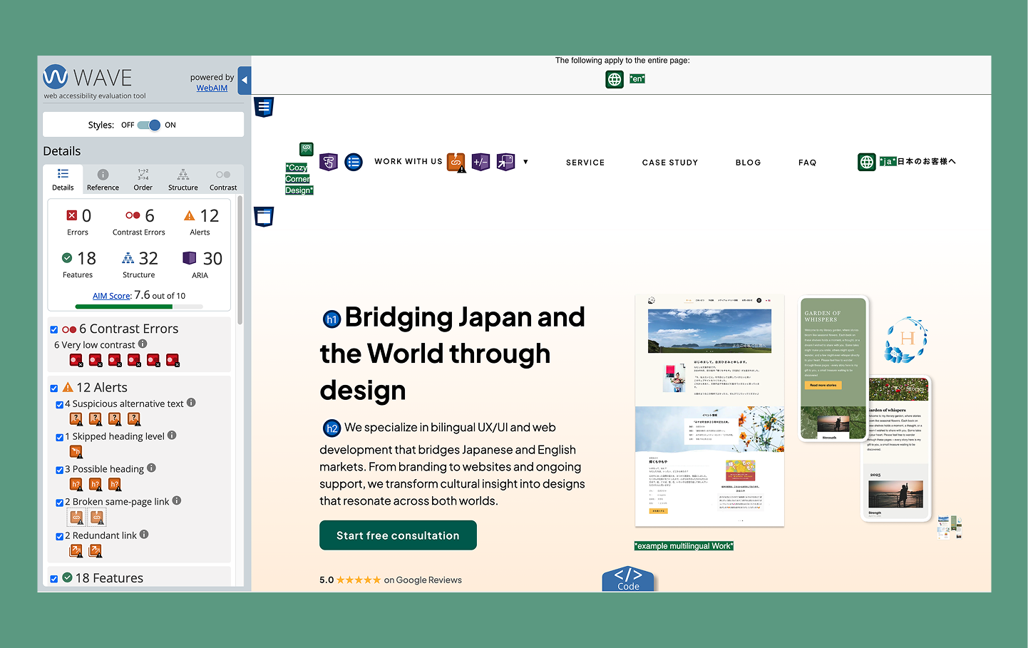
• Google Chrome (Lighthouse)
• WAVE Evaluation Tool
These tools help highlight technical issues like contrast or missing attributes. But they only show part of the picture.
The Questions I'm Asking
The most valuable part of this process isn't the tools — it's the questions. Here are some of the things I'm actively asking as I review my site:
👀 Visual clarity
• Is the text easy to read?
• Do important elements stand out clearly?
⌨️ Keyboard navigation
• Can I navigate the entire site without a mouse?
• Can I access menus, buttons, and links using only the keyboard?
🔊 Screen reader experience (using VoiceOver)
• Does the content make sense when read aloud?
• Are links and buttons clearly labeled?
🔍 Zoom & readability
• Is the site still usable at 200% zoom?
• Does anything break or become difficult to read?
🌏 Language clarity
• Is the content easy to understand for non-native English speakers?
• Are instructions simple and clear?
This is especially important to me as a bilingual designer working across cultures.
🧱 Technical structure
• Is the HTML structured in a meaningful way?
• Are ARIA attributes used appropriately (and not overused)?
What I've Learned So Far
Even at this early stage, a few things have stood out.
When I tried navigating my site using only a keyboard, I realized something I hadn't noticed before — the navigation dropdown menu couldn't be opened using the Tab or Enter keys.
It made me pause, because it meant that some users wouldn't be able to access key pages at all.
After updating the menu to support keyboard interaction and improving the focus states, I started to see navigation differently. It's not just about how something looks or works with a mouse — it's about making sure it works for different ways people move through a site.
Beyond that moment, a few broader patterns have become clear:
• Accessibility issues are often subtle, but impactful
• Design decisions that feel visually "right" don't always translate to usability
• Small changes can make a big difference in how someone experiences a site
Most importantly, I've started to see my own work from a different perspective.
What's Next
In the next post, I'll share the specific issues I found using the tools mentioned in this blog, how I documented them, and how I approached fixing them.
I'll also walk through what those changes mean for users with different needs and abilities, and how even small adjustments can improve the overall experience.
My final thoughts
I don't see accessibility as something you "finish." It's something you consider from the beginning — and continue to refine as you design.
In reality, though, accessibility can sometimes become an afterthought due to timelines, delivery pressures, or budget constraints. That was the case in parts of my own website.
Through this process, I wanted to take a step back and work through those gaps more intentionally — and share that process honestly.
This is still the beginning, but it's already helping me create more thoughtful, inclusive work.
Thank you for reading until the end. I hope you'll come back for the next post 🌱