Have you ever wondered how long a line of text should be for comfortable reading? You may have heard a common rule in English typography: “50–75 characters per line is ideal.” This guideline appears in print, web design, and accessibility standards.
But in Japanese typography, things work very differently. Because Japanese uses full-width characters, no spaces between words, and sometimes vertical writing, the ideal line length (characters per line, CPL) is much shorter.
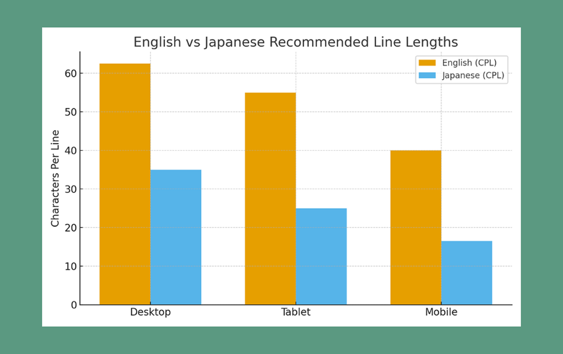
In this post, we’ll compare optimal CPL for Japanese and English across desktop, tablet, and mobile. We’ll also explore why they differ, how the structure of each language affects readability, and what to consider when designing multilingual layouts. A simple chart will visualize these differences clearly.
🛑 Disclaimer:
The character-per-line (CPL) recommendations in this article are based on common UX guidelines, readability research, and industry standards for English and Japanese typography. However, ideal line length can vary depending on font choice, writing style, device type, and the purpose of the content (UI text, articles, captions, etc.). Use these ranges as helpful benchmarks—not fixed rules— and always test with your actual audience to find the most comfortable reading experience for your project.
Why Line Length Matters
Line length affects how comfortably and naturally we read, shaping everything from eye movement to comprehension.
💡 When the line is "too long":
• Your eyes must travel far from left to right.
• It becomes harder to “return” to the start of the next line.
• Readers may lose their place or skip lines without noticing.
➡️ This leads to fatigue, especially on larger screens.
💡 When the line is "too short":
• Reading starts to feel like scanning a grocery list.
• Your eyes bounce too quickly from line to line.
• The rhythm becomes choppy instead of flowing smoothly.
➡️ Short lines can work for headlines, poetry, or captions—but not for long-form reading.
💡 When the line is "just right":
• Maintains a steady reading rhythm
• Reduces eye movement
• Helps comprehension and retention
• Makes the content feel more “inviting” and less tiring
➡️ This is why CPL is one of the most important (and most overlooked) elements of text design.
Let's look at Recommended Characters per Line
Here’s a quick overview of what works best:
English (body text):
English can handle longer lines because spacing between words gives readers natural “breathing points,” and Latin characters are narrow and predictable in size.
1. Desktop: 50 - 75 characters per line
2. Tablet: 45 - 65
3. Mobile: 30 -50
Japanese (body text):
Japanese requires shorter lines because all characters occupy similar visual weight, and kanji pack more meaning into fewer characters. (These ranges are based on JLREQ, UX research, and platform style guides.)
1. Desktop: 30 - 40 characters per line
2. Tablet: 20 - 30
3. Mobile: 13 - 20(even shorter for poems or subtitles)
Why English and Japanese Differ
By contrast, English-speaking websites usually start with user-facing actions or brand story:
1. Character density
A single kanji can hold the meaning of multiple English letters or an entire English word.
Example:
• "国"= "country" (7 letters)
➡️ Because Japanese characters carry more information visually, dense lines become overwhelming fast.
2. No spaces between words
English spacing acts like natural punctuation—it gives the eye rest. Japanese, however, is written continuously, so long lines make it difficult to “chunk” information.
➡️ Shorter lines help the brain process information in manageable pieces.
3. Vertical writing traditions
Japanese books, newspapers, and signage often use vertical text. Vertical lines are, by nature, short—creating a reading culture accustomed to tighter line width. Even horizontal layouts carry this influence.
4. Reading rhythm and cultural expectations
Readers of Japanese often expect:
• Shorter, concise lines
• Natural pauses aligned with phrasing
• Quick scanning on mobile
➡️ This is why subtitles, song lyrics, and poems often use 7–12 characters: it matches the natural tempo of spoken Japanese.
5. Font structure and width
Latin fonts vary in width (e.g., “W” vs “i”), while Japanese fonts have more uniform width. This means Japanese lines visually “fill up” faster.
Here are the practical tips you can apply to your website today!
1. Match device to CPL
• English desktop: 50 - 75 CPL
• Japanese desktop: 30 - 40 CPL
• Mobile Japanese should be especially short: 13 - 20 CPL
If the line feels visually heavy, reduce the width until reading feels effortless.
2. Adjust line height (leading)
• English: 1.4–1.6
• Japanese: 1.6–1.8 (Full-width characters often benefit from slightly more breathing room.)
3. Test your font
Some Japanese fonts are denser or have bolder strokes, making lines feel heavier. A lightweight font can stretch slightly longer lines without hurting readability.
4. Consider content purpose
• UI labels: very short
• Captions: short
• Long-form articles: medium
• Poetry/subtitles: very short
➡️ Let the purpose guide the width. Different content requires different CPL.
5. Multilingual layouts need flexibility
When mixing English + Japanese:
• You may need separate containers with different max-width values.
• Let each script have its ideal width—don’t force them into a single layout rule.
• For bilingual websites, consider toggles or layout adjustments per language.
6. Prototype with real content
Place real Japanese characters (not lorem ipsum) in your designs.
Japanese “dummy text” often looks less dense than actual writing, and it can mislead your layout decisions.
CSS Examples
<style>
/* English article layout */
.article-en {
  font-size: 16px;
  line-height: 1.5;
  max-width: 66ch; /* ~66 characters per line */
  margin: 0 auto;
}

/* Japanese article layout */
.article-ja {
  font-size: 16px;
  line-height: 1.6;
  max-width: 35ch; /* desktop */
  margin: 0 auto;
}

@media (max-width: 900px) {
  .article-ja {
    max-width: 25ch; /* tablet */
  }
}

@media (max-width: 480px) {
  .article-ja {
    max-width: 16ch; /* mobile */
  }
}
</style>
The ch unit is especially useful—it adapts to character width and keeps line length consistent across fonts.
Final Thought
The “just right” line length depends on both language and device.
🌟English : 50 - 75 characters per line feels natural on desktop, slightly fewer on mobile.
🌟Japanese : 30 -40 characters is plenty, with even shorter lines for mobile and expressive writing.
By understanding these differences, you make reading smoother, friendlier, and more enjoyable. Whether your audience reads in English, Japanese, or both, thoughtful line length helps your message land with clarity and comfort.