Last month, I wrote about why accessibility matters for small businesses and why I decided to start reviewing my own website through a more accessibility-focused lens.
This month, I wanted to go a little deeper.
Rather than approaching accessibility as a broad concept, I focused on something much smaller and more specific: my homepage.
At first, I expected the process to be mostly technical. I assumed I would run a few tools, identify some issues, make a couple of fixes, and move on.
But as I started actively testing my site in different ways, I realized this process was much less about simply "passing accessibility checks" and much more about understanding how people actually experience a website.
Not just how it looks when everything is functioning normally, but how it feels when someone is:
• navigating using only a keyboard
• zooming in to comfortably read content
• relying on touch interaction on mobile
• or listening to content through screen readers and VoiceOver
As I tested my site through those different experiences, issues started surfacing that would have been difficult to discover through normal browsing alone.
Some interactions looked completely fine visually, but became difficult to use with a keyboard. Some labels technically existed, but felt unclear when read aloud. Some layouts worked under normal conditions, but started breaking at higher zoom levels.
That shift in perspective became one of the most valuable parts of this process.
My website itself is relatively simple — built with HTML, CSS, and JavaScript rather than a website builder platform. Because of that, some of the technical fixes may look different depending on how a website is built. But the larger lessons behind them felt much more universal: clarity, usability, communication, and designing with different experiences and situations in mind.
More than anything, this process reminded me that accessibility issues are often difficult to discover unless we intentionally test websites in different ways.
⚠️ Disclaimer:
This audit reflects my own website and learning process as I explore web accessibility and WCAG. The observations and improvements shared here may vary depending on your website, goals, and users. Please use this as a reference, not a fixed standard.
Slowing Down Enough to Experience the Site Differently
To evaluate my homepage, I combined automated tools with manual testing.
I used tools like:
• Google Chrome Lighthouse
• WAVE Evaluation Tool
These helped surface technical issues such as low color contrast, touch target sizing, unclear labels, and structural accessibility concerns.
But after a while, I realized something important: the tools could tell me where problems existed, but they could not fully show me what the actual user experience felt like.
So instead of only reviewing reports and scores, I started interacting with my site differently.
• I tried navigating without a mouse.
• I zoomed the browser to 200%.
• I tested mobile interactions more carefully.
• I listened to how content and labels were read aloud through VoiceOver.
And through those experiences, I started noticing issues that would have been very easy to miss otherwise.
Not because the website was dramatically broken, but because certain problems only became visible when the site was experienced under different conditions and interaction methods.
That was one of the biggest takeaways from this process: accessibility auditing is not only about identifying technical problems. It is also about intentionally experiencing a website from perspectives we may not normally consider during everyday design and development work.
Documenting the Process Changed the Way I Thought About It
As I continued testing, I realized I needed a better way to organize what I was finding. So I created a simple accessibility audit sheet in Notion.
At first, it was mostly practical: a place to keep track of issues so I wouldn't get overwhelmed by them. But over time, it became something more valuable than I expected.
For each issue, I documented:
• the page
• the affected component
• issue type
• priority and status
• what I observed
• how it could impact users
• how I fixed it
• and what I learned from the process
I also added screenshots to visually capture each issue as I discovered it.
What surprised me most was how much documenting slowed me down in a good way. Instead of immediately rushing to "fix" something, I started asking:
• Why does this matter?
• What kind of experience does this create?
• Who could struggle with this?
• When does this issue start affecting the experience?
That shift in mindset ended up becoming one of the most meaningful parts of the audit.
The Things I Started Seeing Differently
⌨️ Navigation Isn't Only About Menus
One of the first things I noticed was that my dropdown navigation menu couldn't be opened using only a keyboard.
What stood out to me wasn't only the issue itself, but how differently the experience changed once I stopped relying on a mouse. Visually, the navigation looked completely functional. If I used a mouse, everything worked perfectly.
But the moment I removed that one method of interaction, important parts of the site became inaccessible.
That experience changed the way I think about navigation. I started realizing that navigation is not simply about organizing links neatly on a page. It's about helping different people move through a website comfortably using different methods and abilities.
Something can feel polished on the surface while still quietly creating friction underneath.
👀 Readability Is More Emotional Than I Realized
Another thing I began noticing was how much readability affects the overall feeling of a website.
Some of my text colors were softer and lower contrast because visually they felt subtle and refined. But when I stepped back and reviewed the site more critically, I realized some areas were simply harder to read than they needed to be.
Not dramatically unreadable. Just slightly tiring. Slightly unclear. Slightly easier to skip over.
And those small moments add up.
That realization helped me understand accessibility less as a "requirement" and more as part of communication itself. When content is easier to read, users spend less energy trying to interpret the interface, which means they can focus more naturally on the content and message.
It reminded me that clarity itself can be part of a calm and thoughtful user experience.
📱 Mobile Interactions Feel Different in Real Life
While testing on mobile, I also discovered several interactive elements that technically worked, but felt uncomfortable to tap. Buttons, pagination dots, and smaller interactive elements looked visually balanced on screen yet didn't always feel reliable during actual use.
That distinction became surprisingly important. Designing something that looks minimal and designing something that feels comfortable to interact with are not always the same thing.
What I appreciated about this discovery was realizing that accessibility improvements do not always require dramatic visual changes. Sometimes a user experience improves through invisible adjustments:
• slightly larger interaction areas
• better spacing
• or more forgiving touch behavior
The interface may look almost identical while feeling noticeably easier to use.
🌏 Accessibility Is Also Reflected in Language
One of the smallest changes I made ended up becoming one of the most memorable parts of this process.
Originally, my mobile navigation button used the aria-label: "Toggle navigation."
From a developer's perspective, the label technically made sense. It accurately described the function of the button. But as I continued learning more about accessibility, I started thinking about how this label might be experienced differently by users relying on voice control tools.
For example, with tools like Apple Voice Control, users may interact with interfaces by literally speaking commands out loud. In reality, someone is much more likely to say "Open menu," "Tap menu," or simply "Menu" — rather than "Toggle navigation."
And if the label does not match the natural language people actually use, the interaction can become confusing or in some cases, difficult to trigger at all.
So I changed the label to something much simpler: "Menu."
It was an extremely small change, but it shifted the way I think about accessibility quite a bit. This experience reminded me that accessibility is not only about technical structure or code compliance; it is also about choosing language that feels natural, intuitive, and easy for people to understand and interact with.
As someone working across languages and cultures, this felt especially meaningful to reflect on.
In many ways, good accessibility and good communication are deeply connected.
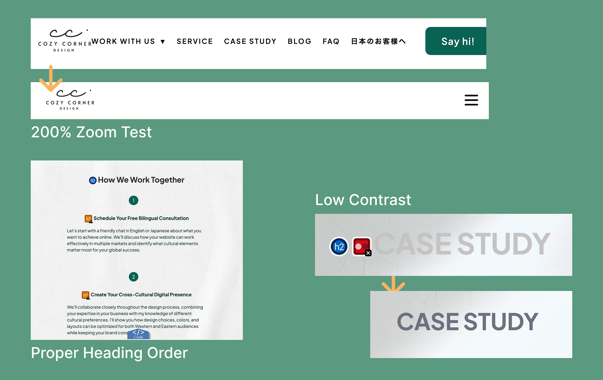
🔍 Responsive Design Doesn't End With Screen Size
Another moment that stayed with me happened during zoom testing. At 200% browser zoom, parts of my navigation began overlapping and breaking.
What surprised me was that the layout had technically been responsive already. But responsive at default viewing conditions didn't necessarily mean usable at enlarged viewing conditions.
That distinction changed how I think about responsive design. It's not only about adapting to device widths. It's also about adapting to different ways people need to read and interact with content.
Zoom testing reminded me that layouts can behave very differently once people interact with them under conditions outside of default viewing settings.
What This Process Is Really Teaching Me
One of the biggest things this accessibility audit has taught me is that many accessibility issues are difficult to notice during normal browsing.
It wasn't until I intentionally started testing my site in different ways that certain problems began to appear.
For example:
• navigating using only a keyboard
• testing with VoiceOver and screen readers
• zooming the browser to 200%
• interacting with the site more carefully on mobile devices
Through those experiences, I started noticing issues that would have been easy to miss otherwise. Things that looked completely fine during normal use sometimes became difficult to access, harder to understand, or uncomfortable to interact with under different conditions.
That shift in perspective became one of the most valuable parts of this process. More than simply "finding problems," accessibility auditing started to feel like a way of better understanding how people actually experience a website.
It also reminded me that accessibility is not something to think about only after a website is finished. In many ways, it's something that should be considered throughout the design and development process: testing different interactions, questioning assumptions, and thinking about how a site feels across different situations and users.
And interestingly, many of the accessibility improvements I made also improved the overall user experience more broadly — making the site feel clearer, easier to navigate, and more comfortable to use in general.
What's Next
This is still very much an ongoing learning process for me. As I continue reviewing other parts of my website, I want to keep documenting not only the issues themselves, but also:
• how they were discovered
• how different testing methods changed my perspective
• and what these changes might mean for different users and situations
Accessibility can feel overwhelming or highly technical at first. But this experience has shown me that many improvements begin with something much simpler: taking the time to test intentionally, trying different ways of interacting with a site, and slowing down enough to experience it from perspectives we may not normally consider.
Thank you for reading, and I hope to continue sharing more of this process in future posts. 🌱